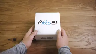
Most orthodontic kits come in plain packaging, even plastic bags. So when World Class Technology and Ernest Packaging Solutions teamed up to showcase the Pitts 21 orthodontic system, they set out to give clinicians a different kind of customer experience.
We talked with Eric Ackerman, marketing manager of World Class Technology/OC Orthodontics, and Stephen Simich, creative design director at Ernest Packaging Solutions, about how paper packaging was instrumental in developing a kit that orthodontists could sink their teeth into.
Unboxing Great Packaging Design from Ernest Packaging Solutions
On Designing for Human Touch
Ackerman: You need something tactile. Something might look great on the internet, but when you can feel it, you’re participating in the package. We do a lot of trade show events for that reason—you need to get in front of the doctor so they can experience it. When they see high-end packaging like this, they know right away that this is a modern, sophisticated product. It’s more than aesthetics; it’s the feel. That’s one of the things packaging can do.
We’re in a field of giants. We wanted to be perceived as being able to compete with the big companies—because we can, even though we have a smaller company. We believe we have the best product, and we need all of our marketing materials to reflect that. That’s what we were aiming for with this package. When other companies sell kits, they may come in a plastic bag. That’s how they’ll deliver it, because it was never important to them. By making everything go into this box and having a presentation, you see the flagship product jumping out at you.
Simich: Regardless of their title and schooling, the clinician is still a person. So I put myself in the position of being the recipient of the packaging. With this packaging, I know darn well that it’s a Pitts 21; it’s not going to be confused with any other product line.
On Giving the Consumer a Present
Ackerman: When someone receives this for the first time, we want them to feel some anticipation. It’s set up like a present. The package has unique glimmer and gloss to it and the right amount of matte, so it’s both visually appealing and tactile. You want to touch it. If ever there were to be an unboxing video for an orthodontic product, this is the one.
Simich: People care about unboxing because when you receive a package, it’s an experience. It’s special; it’s just for you. There’s an intimacy because you’re the recipient of something special. I get that experience all the time with the designs we come up with as a team. It’s a birthday for me every single day when I walk into our design center because I’m seeing something that hasn’t been done before.
On the Unique Possibilities of Paper
Ackerman: When the packaging came from Ernest to us, we needed them to be flat-packed for storage in our inventory area and able to be assembled quickly. Ernest was able to help us do that. We got so much for our money—they made it folded flat, and we were able to get this entire package in this really cool flat box with simple construction that comes together intuitively. It’s almost like origami.
Simich: In terms of warehouse space, folding carton is such a wonderful material to work with. We also chose folding carton because of its formability as far as cutting dies and printing plates, and coatability as far as representing their branding and marketing. It’s a sound solution—we don’t have to include any other components. It’s 100 percent paper. So in terms of being environmentally friendly, you don’t have to separate anything because it all goes into the paper recycling bin.
We gave parts of the package a gloss—there’s a little bit of a raise to the surface, and this is where the light refraction comes in. There’s a depth associated with it; it isn’t two-dimensional. It’s like the facets of a diamond, where you get different shades and densities of light. It captivates you.


